about the design
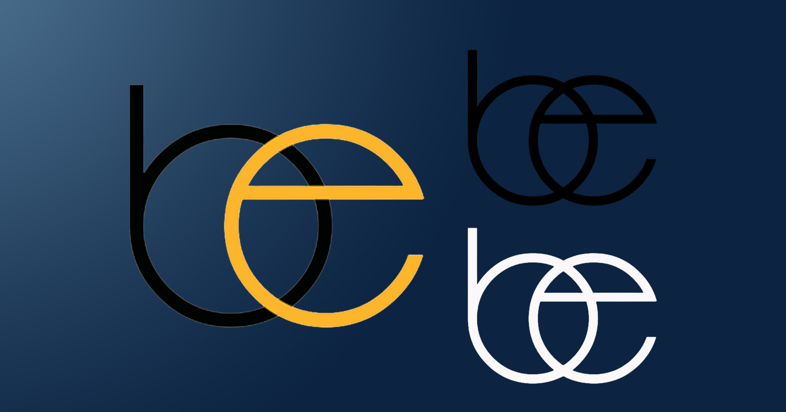
Developed a smart, professional monogram that likely represents “BE” initials. The overlapping design suggests connection, collaboration, or integration. This logo is perfect for this property management and maintenance business.
design features
- The “b” in black positioned on the left
- The “e” in golden orange/amber overlapping on the right
- Circular bowls of both letters intersect, creating depth
- Horizontal bar of the “e” cuts through the composition
- Simple, elegant interlocking effect